Menu
Close
- home
-
about
-
about us
-
Careers
-
-
services
-
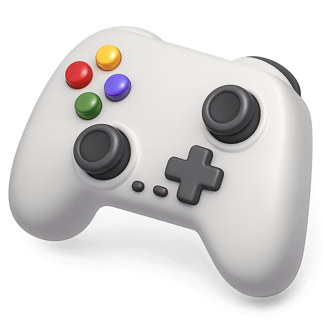 Game Development
-
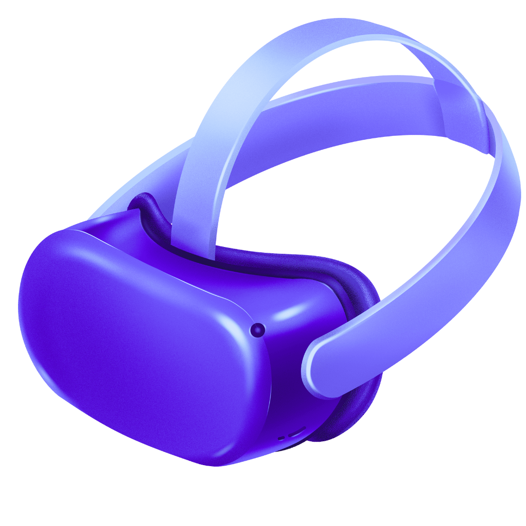 VR/XR Development
-
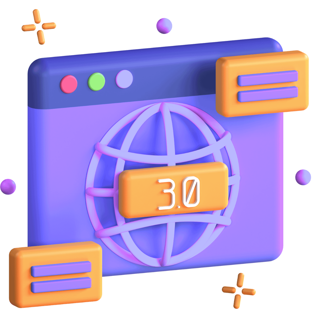 Blockchain and Web3 Development
-
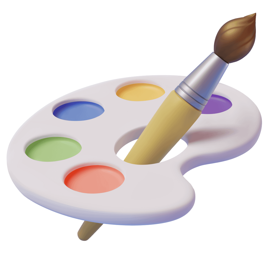 Game Art
-
 Resource Augmentation
-
 Data Science
-
- case studies
- blogs
- home
-
about
-
about us
-
Careers
-
-
services
-
Game Development
-
VR/XR Development
-
Blockchain and Web3 Development
-
Game Art
-
Resource Augmentation
-
Data Science
-
- case studies
- blogs


")


")


")
")


")
")


")
")

")
")